Understanding how to use contrasting colours in your food photography
This is an aspect of food photography which is used extensively but you may not be consciously aware of it. To keep it straight forward, there are warm colours, browns, orange and reds. Cooler colours like blues and greens. Mixing these colour temperatures within your food photography will bring a bit of punch to the picture.
Most often the contrast comes between the food colour and the dish or plate it’s served on. Here’s an example of using contrasting colours to bring a bit more interest.
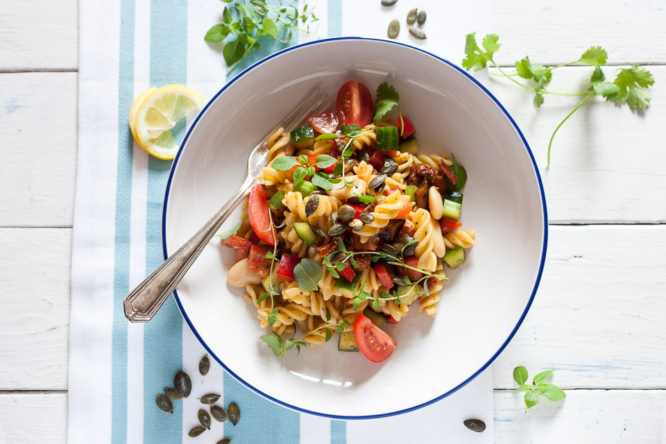
Pasta Salad photographed and published for The Vegetarian Society
In this pasta salad image, commissioned by The Vegetarian Society, there are plenty of different warm tones in the food. The reds, yellows and browns contrast with the cooler green within the dish. The colours pop off the white dish and contrast directly with the hard, blue rim.
Then we have the light blue of the towel which contrasts with the food and more subtly with the yellow of the lemon pieces. The wooden background is mostly white with blue coming through, acting as a very subtle contrast to the food and brought out a little more by the green of the herbs.
You will also see how the whole image is layered up. From the background to the different layers of the food in the dish. I talk more about this in Building Up Layers in Food Photography.
Here’s another example where we’ve used contrasting colours in food photography.
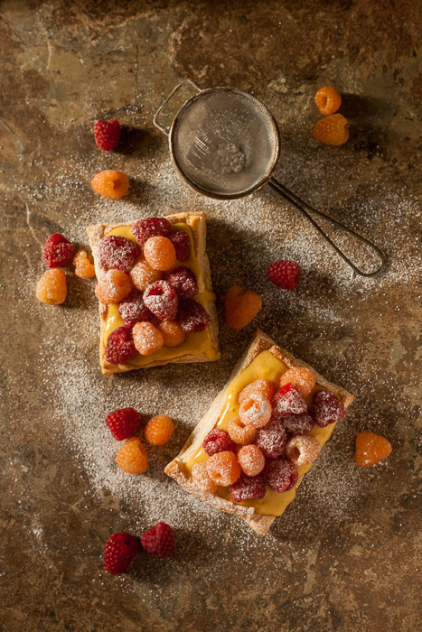
In this case, it’s a little harder to see how these are contrasting. Most of the tones seem warm, the obvious cooler colour is the white of the icing sugar. The white creates a highlight and draws your eye to it, keeping your focus on and around the food. The background is mostly a warm tone but there is some green that is coming through, which is the cooler colour.
As you see, there are no fixed rules to go by. You don’t need to have a distinct and obvious contrast in your colours. In fact, you don’t have to have them at all. You could have an overall temperature feel to your shot, and texture is the contrast. I’ll talk about textures at another time.
Take a look at different food photography and you’ll be able to spot the contrasts and begin to understand how it’s been used.
That’s all for today, I’ll see you back here very soon.
![]()